UX / UI DESIGN
Nike App Redesign
Nike+ Run Club is an app designed to provide users with guidance, motivation and training programs for athletes of all levels. I’m a frequent runner and use the app to keep track of my runs and to motivate me. I have had my own personal frustrations with the application and decided to apply my UX techniques to make improvements.
PROJECT OVERVIEW
Thoroughly evaluating current features of the application will assist me in finding initial flaws in user flows, visual hierarchies and overall grouping.
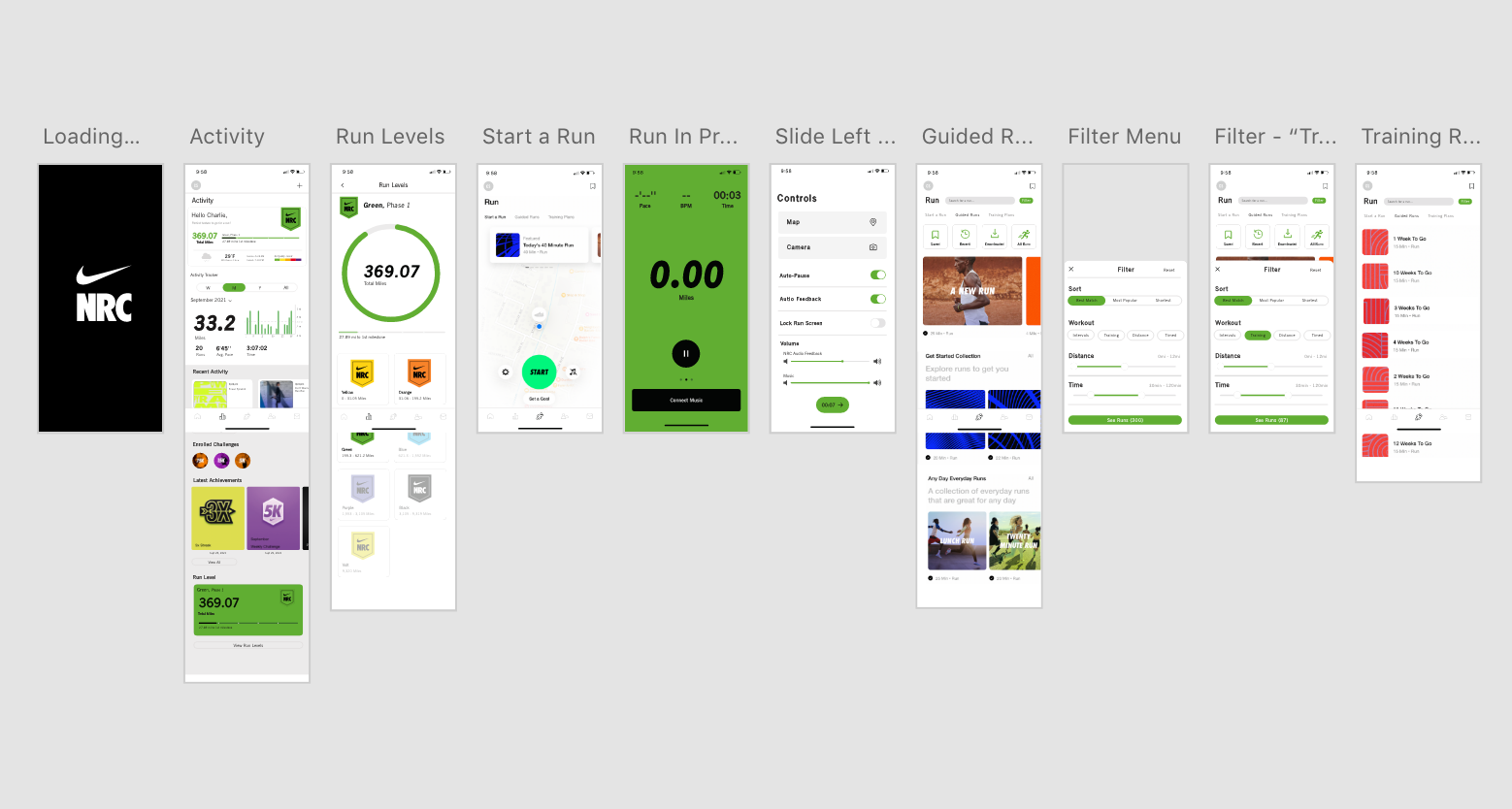
Activity Page
The current activity page consists of users running stats, recent runs, acheivements and NRC Run Level. The overall display of information is plain and not very motivating.
Run Levels
Each level is associated with a different color that is used throughout the app and changes when you level up. Progress is tracked using a horizontal bar and visually doesn’t motivate users to want to reach the next level.
Guided Runs
Guided runs are a big part of NRC, they vary from casual to interval training and even have programs geared towards marathons and pregnancy. The current page groups similar runs together for users to choose from. They also have sections that show users their saved runs, recent runs and downloaded runs (for offline usage). When viewing all runs there is no order or way to search for specific runs/ narrow your search.
Run Screen
During your run the app will show you your stats live and progress during. Features such as users Running Pace, BPM, Time, Miles, Calories and Cadence are all recorded.Users can edit which features are displayed by tapping on them to edit it. Swiping left displays users mile splits. Swiping right shows controls users have access to during the run, such as locking the run screen, audio feedback, auto pause feature, camera and map usage.
User Research
Given my restricted timeline on this mini app revamp project I was only able to work with a small group of users for testing. I asked a few general questions to help me understand the users and their why for running and to find user patterns. As well as some questions on their frustrations with the application. I’ve organized the gathered data into the below charts
What’s your why?
By categorizing users answers for why they run helps me make more defined goals for users.
%
Health + Fitness
%
Relieve Stress & Relax
%
Training / Improve Runnig
Had users answer yes or no questions toget info on app usage and users goals /problems
%
Listen to Music on Runs
%
Lack of Motivation
%
Use Guided Runs
%
Lack of Time

After gathering and organizing data taken from user interviews I began to come across common themes and different users needs. I then focusrd on the following problems.
- Personalized Dashboard
- NRC Controls
- Simpler Flows
- Emphasis on motivating features
PROBLEMS
LACK OF MOTIVATION
More than half of the users interviewed use the application to further their fitness journies and as motivation. The displays on the activty page don’t highlight recent achievments, progress to new levels and encourage users to wantto run more overall.
UNORGANIZED RUN CATALOG
Challenge: When browsing the guided runs, there is no search function or way to filter runs. Makes it difficult to search for runs and makes users scroll endlessly through all options.
USER FREEDOM AND CONTROL
Lack of freedom in the controls for audio adjustments during users runs. The NRC audio feedback typically overpowers users music.
RUN LEVELS AREN’T EMPHASIZED
The run levels on the app
SOLUTIONS
improved visual heirarchies
Created a personalized space in the activity page for them to track their run level overall progress. Emphasized recent achievments and highlighted any enrolled challenges.
FILTER & SORT SEARCH FEATURE
Created a search barso users caneasily search for runs without having to scroll through all options.For users who are looking for a run to do in the ‘All Runs’ can filter through differentkinds of workouts, distance based and time based.
AUDIO CONTROLS
Creating the option to adjustthe audio ofthe NRC feedback and music allows the runnner to customize their experience running.
BREAKING DOWN RUN LEVELS
Nike Run Club Levels are measured by users total miles ran during the time they first created an account. Every level the amount of miles it takes to”level up” doubles, going from 31 mi in the ‘Yellow Level’ to 466 mi in the ‘Green Level’. By breaking down the level progress into Phases, users are to ableto visual their progress better and motivate them more.
flow 1
PERSONALIZED ACTIVITY PAGE
The task features a user exploring the updated activity page. Now users have a dashboard at the top to display run level progress and weather conditions/air quality. More condensed running stats,recent activity and achievements to cut down on scrolling. The run levels have also been broken down into phases to motivate users and make them feel more accomplished hitting milestones.
flow 2
FILTERED GUIDED RUNNING PAGE
A large pain point for users is lack of time and lack of motivation. Guided runs are an easy way to motivate users of all ages during their runs. By implementing a search function, as well as a filter & sort feature makes searchinng for a run easier. Users are able to search for runs without having to scroll through all of the options. Cutting down the search time and making it less overwhelming for users with the 200+ options on the app.
flow 3
ADDITIONAL CONTROL FUNCTIONS
Most users I interviewed primarily use guided runs for their workouts with the app. The audio feedback during runs completely overpowers the users music without any option to lower it or raise the music volume. By adding a volume control for the feedback from NRC and the users music. Users can customize the audio during their runs, and make it more enjoyable.
APPLICATION RE-DESIGN OVERVIEW


